Logo
Our marks, their variants and the clear space rules that keep them recognizable everywhere.
Logo mark
Our symbol — the letter "S", recognizable on its own.

Scaleflex symbol
The icon uses the first letter "S" — a soft, modern mark that still keeps its edges. Use it on its own where space is tight: app icons, favicons and avatars.







Logo improper uses
Only approved lockups may be used — no distortions or effects.

Don’t add blur
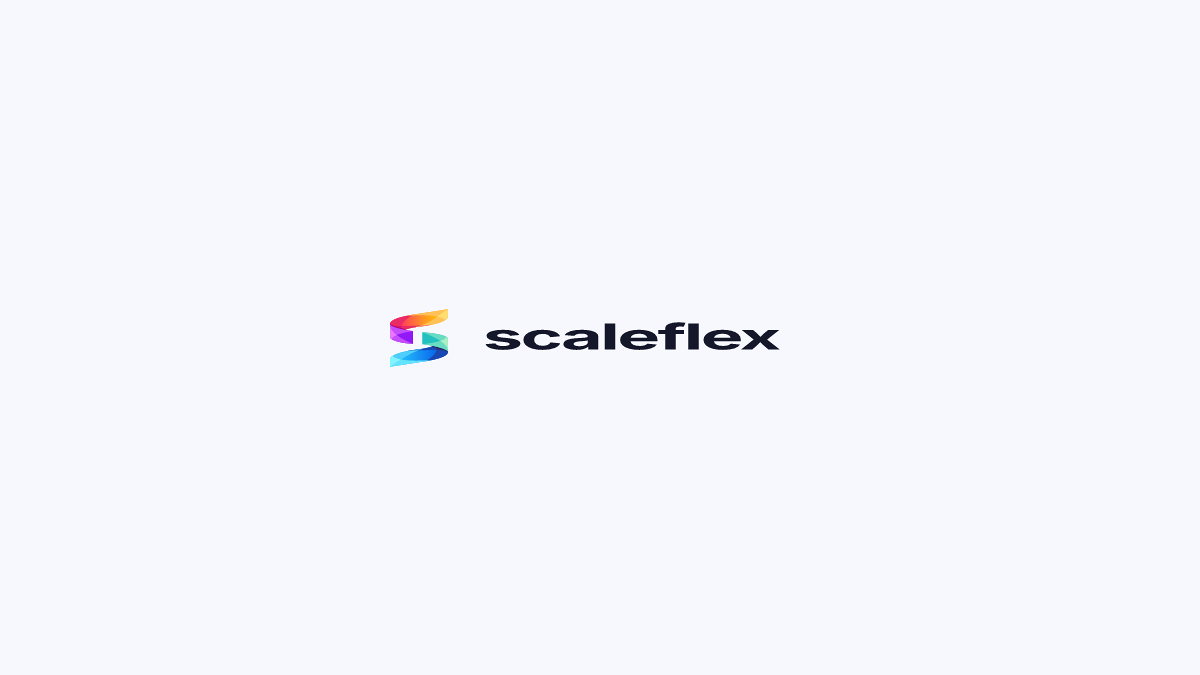
Don’t distort

Don’t add shapes around it
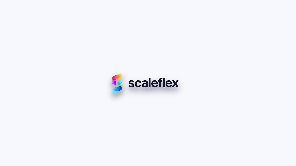
Don’t add shadow
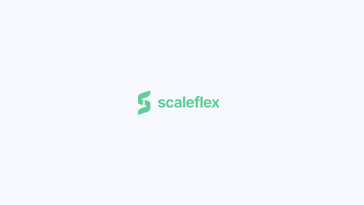
Don’t recolor the icon
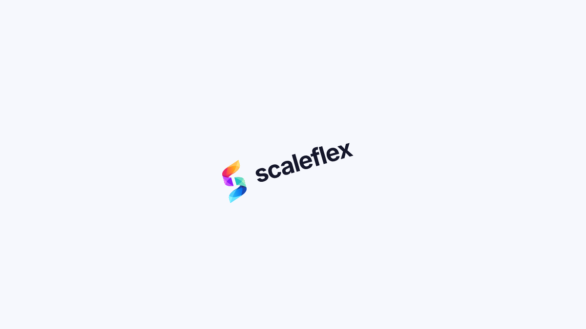
Don’t rotate
Logo on background
Keep contrast clean — no clashing colors or busy imagery behind the logo.

Monochrome on white/black
Avoid — the mark loses its gradient identity.

Mismatched solid color
Avoid — a ground colour that fights the mark.

Light gradient background
Avoid — too little contrast under the wordmark.

Poorly matched gradient
Avoid — off-palette gradients behind the logo.
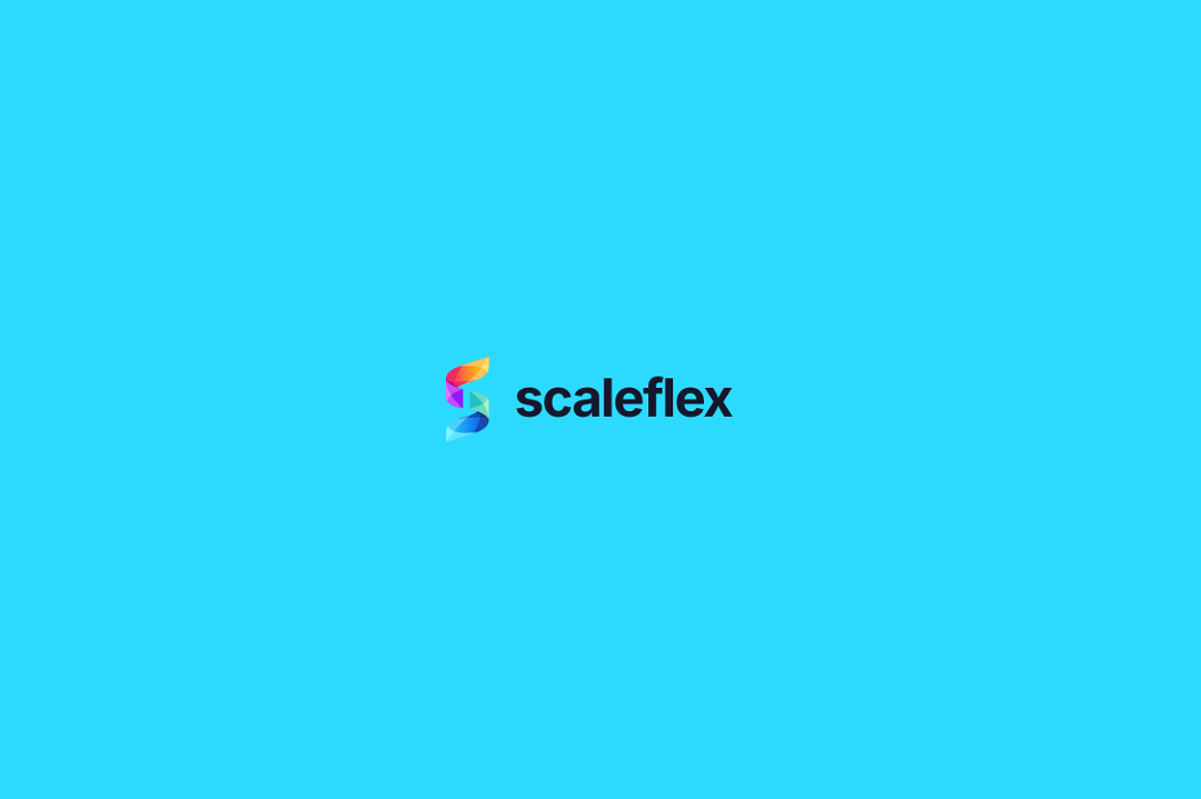
Color too close to logo tones
Avoid — the symbol stops separating from the ground.
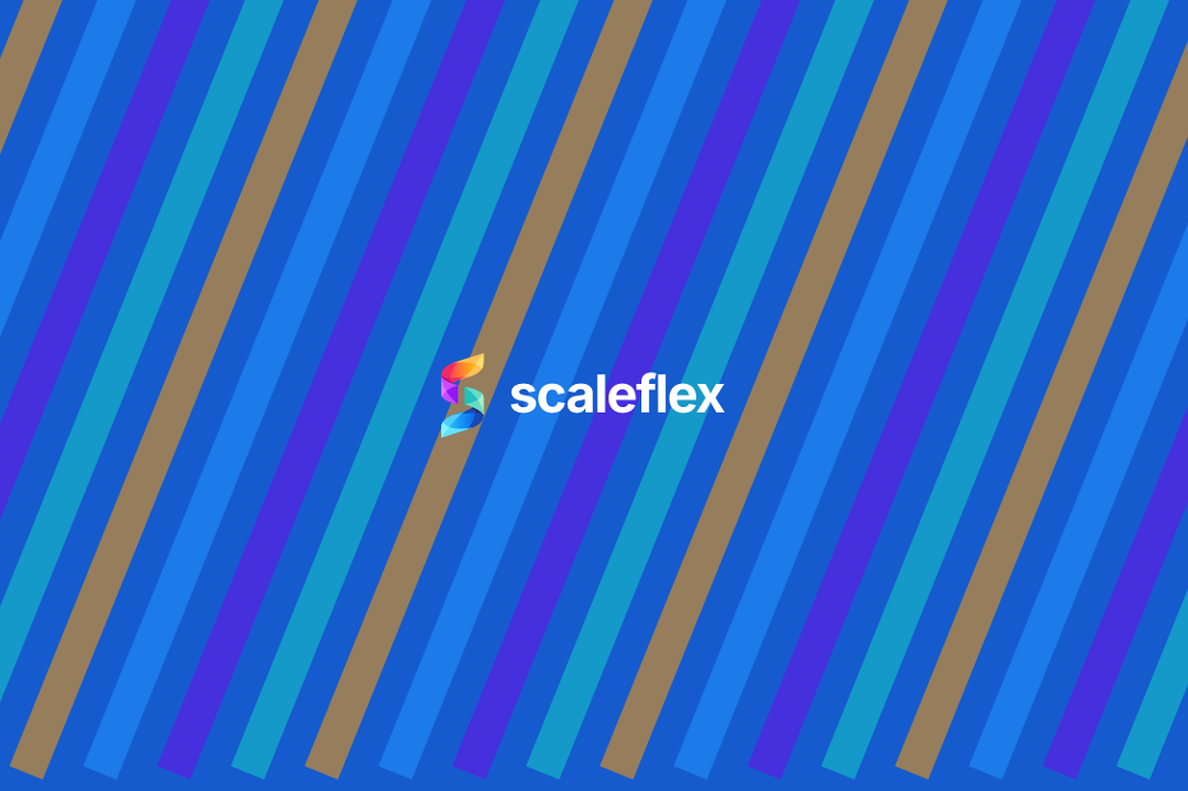
Complicated background image
Avoid — lay a plain surface or a scrim under it first.
Use cases
How the logo behaves in real placements. Pick the version that keeps contrast.

On light surfaces — use the dark logo on white and pale backgrounds.

On dark surfaces — switch to the white logo on dark or brand-blue backgrounds.

Over imagery — white logo on photos, with a scrim so contrast never drops.

Minimum size — never smaller than 24px tall on screen, 12mm in print.
Single-color logo
Solid marks for non-color print — pick the version that fits your background.
Used when printing with non-color methods, or on dark backgrounds where the gradient can't reproduce.
Used when printing with non-color methods, on light backgrounds.
When using different imprint methods other than color printing, on light backgrounds to use.